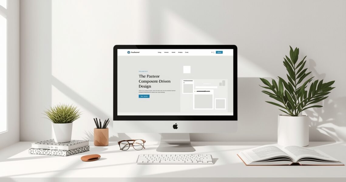
Elementor Component-Driven Design: Build Faster, Smarter, and More Consistently
Ever felt like you’re rebuilding the same button or testimonial section across multiple pages? Frustrating, right? Enter Elementor component-driven design – a game-changing approach that transforms how you build websites. Instead of focusing on individual pages, you’ll concentrate on reusable, consistent blocks. It’s about designing your site with efficiency and future growth in mind, making your design process faster, smarter, and far more consistent.
Why Embrace Elementor Component-Driven Design?
Adopting a component-driven approach for your Elementor projects isn’t just a best practice; it’s a productivity superpower. Here’s why you should make the switch:
Boost Your Speed & Efficiency
Imagine having a library of pre-built, perfectly styled sections ready to drag-and-drop. No more recreating elements from scratch! Component-driven design drastically cuts down development time, letting you focus on unique page content rather than repetitive styling tasks.
Ensure Unwavering Consistency
Branding is key, and consistency reinforces it. By using components, every button, heading, or card across your site will look and behave identically. This eliminates design drift and ensures a polished, professional user experience that keeps your brand strong.
Simplify Maintenance & Updates
Need to change the primary button color site-wide? With a component-driven approach, you simply edit one global component, and that change automatically propagates everywhere. This makes updates a breeze and significantly reduces the risk of errors across your site.
The Core Principles of Component-Driven Design in Elementor
To truly harness Elementor component-driven design, you need to understand its key concepts:
Think in Components, Not Pages
Shift your mindset from designing full pages to designing individual, self-contained elements. A hero section isn’t just a part of the homepage; it’s a ‘Hero Component’ that can be used and reused across various pages of your site.
Atomic Design Philosophy (Briefly)
Inspired by Brad Frost’s Atomic Design, think of your site elements like atoms (buttons, text), molecules (forms, navigation), search bars), and organisms (hero sections, footers). Each builds upon the last, forming a robust and scalable design system.
Single Source of Truth
Each component should have one definitive, master version. When you save an Elementor template or global widget, that becomes your ‘single source of truth’ for that specific component. Any changes to this master update all instances.
Architecting Your Elementor Components: A Step-by-Step Guide
Ready to build your component library? Here’s a practical guide to get you started:
Step 1: Identify Common Elements
Look at your designs or existing sites. What elements repeat regularly? These are your prime candidates for components:
- Buttons: Primary, secondary, ghost.
- Cards: Product cards, service cards, team member cards.
- Testimonials: Single, carousel.
- Forms: Contact, newsletter.
- Sections: Hero, CTA, Features, Footer, Header (often separate for Elementor Pro).
Turning these repetitive elements into components will save you tons of time.
Step 2: Design Your Base Component
Start with the simplest version of your component. For a button, define its typography, colors, padding, and hover states. For a card, set up its image, title, text, and button slots. Get it perfect!
Quick Tip: Leverage Elementor’s Global Styles
Always begin by setting your Global Colors and Global Fonts in Elementor Site Settings. This ensures your components automatically inherit foundational styles, making them incredibly flexible and simple to update site-wide.
Step 3: Save as a Global Widget/Template
Once your component is designed and perfected:
- For individual widgets (like a button): Right-click on the widget and select ‘Save as Global Widget’.
- For sections or complex blocks (like a card or hero section): Save the entire section/container as a template (
Template > Save as Template).
Don’t want to build from scratch? PasteElement offers a vast library of professionally designed, component-ready Elementor blocks and templates. Get a massive head start on your component library today!
Step 4: Create Variations & Adaptations
Once you have a solid base component, you can easily create variations. For instance, you might need a ‘dark theme’ card or a ‘small’ button. If using global widgets, you can duplicate and then unlink to modify, or create entirely new templates for more distinct variations.
Step 5: Document Your Components (for larger projects)
For bigger projects or when working with a team, consider creating a simple style guide or component library document. This helps everyone understand exactly what components exist, their intended use, and how to implement them correctly.
Practical Tips for Implementing Component-Driven Design
To truly maximize your efficiency with Elementor component-driven design, keep these tips in mind:
- Consistent Naming Conventions: Use clear, descriptive names for your templates and global widgets (e.g.,
Card - Product,Button - Primary,Section - Hero - Dark). This makes them easy to find! - Organized Folder Structure: In your Elementor Template Library, create logical folders for ‘Buttons’, ‘Cards’, ‘Sections’, etc., to keep your growing library tidy and manageable.
- Test Components in Isolation: Always ensure your component looks and functions correctly on its own before integrating it into a full page. This prevents headaches down the line.
- Leverage Elementor’s Global Styles: We can’t stress this enough! Global styles are the absolute foundation of true component-driven design in Elementor, making everything easier to manage.
- Use Dynamic Tags Wisely: For content that changes (e.g., post titles, ACF fields), integrate dynamic tags into your components. This ensures maximum reusability and flexibility.
Your Component-Driven Design Workflow Checklist
- ✓ Identified repeating elements?
- ✓ Established Global Colors & Fonts?
- ✓ Designed base component?
- ✓ Saved as Global Widget/Template?
- ✓ Organized templates with clear naming?
- ✓ Tested component reusability?
Supercharge Your Workflow with PasteElement
Adopting Elementor component-driven design is a game-changer for productivity. But what if you could fast-track that process even further, without starting from scratch? PasteElement is designed precisely for this! Our extensive collection of pre-built, expertly crafted Elementor blocks and full-page templates are essentially production-ready components. They adhere to best practices, are fully responsive, and integrate seamlessly into your Elementor workflow.
How PasteElement Boosts Your CDD:
- Instant Component Library: Access hundreds of professionally designed buttons, cards, headers, and more – all built with consistency and reusability in mind.
- Quality & Consistency Guaranteed: Our templates follow strict design guidelines, giving you a perfect starting point for your own robust component system.
- Save Hours, Not Minutes: Stop building from scratch. Simply drag, drop, customize, and launch your projects faster than ever before.
Ready to truly transform your Elementor projects? Explore PasteElement’s library today and experience the true power of component-driven design without the heavy lifting!
Conclusion: Build Smarter, Not Harder
Embracing Elementor component-driven design isn’t just a passing trend; it’s a fundamental shift towards a more efficient, consistent, and scalable web development process. By consciously thinking in reusable blocks, you empower yourself to build better websites, faster, and with far less frustration.
Start small, identify your core components, and watch your productivity soar. And remember, for a massive head start and to truly accelerate your projects, PasteElement is your ultimate partner in building exceptional Elementor sites with speed and precision.